
Dot gain explained: why your print looks darker than the file
You approve a design on a bright screen, and the printed piece comes back heavier and darker than you expected. Most of the time the culprit isn't a mistake — it's dot gain, a normal property of every printing process. Here's what it is and how to design around it.
THE SHORT ANSWER
Dot gain — also called tonal value increase, or TVI — is the way halftone dots print larger than they are in your file, so tones come out darker and richer than they look on screen. It happens on every press because ink spreads where it meets the substrate and light scatters beneath it. It's normal and predictable; the job is to plan for it so shadows don't plug and fine detail doesn't disappear.
- Dots grow — a midtone in the file prints as a heavier, darker midtone on the sheet
- Midtones move most, and heavy shadows can fill into a flat, detail-less solid
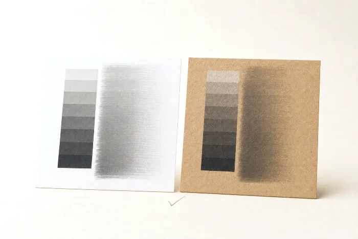
- Absorbent and flexible substrates (uncoated, kraft, film) gain more than coated ones
- Printers control it by characterizing the press and pulling tones back to a standard
- You design for it by easing back dark shadows, avoiding hairline reversed type, and proofing on the real material
What dot gain actually is
Almost every image on a package is printed as halftone — a fine pattern of tiny ink dots that your eye blends into a continuous tone. A photograph's soft grey, a brand's tinted background, a subtle drop shadow: none of them are a solid layer of ink. They're a field of dots, some big, some small, spaced so the paper shows through in between. The bigger the dots and the less bare substrate between them, the darker the tone reads.
Dot gain is what happens when those dots print larger than the file specified. A tone that was built to cover a certain fraction of the surface ends up covering more, because each dot physically spreads and, on many materials, also looks bigger than it is. More ink coverage means a darker, more saturated result — so the printed piece comes out heavier than the on-screen design. The formal name in the ISO standards is tonal value increase (TVI): the measured tonal value on the sheet minus the tonal value you asked for. It's the same phenomenon, stated as a number.
The key mental shift is that dot gain is not a defect to be eliminated. It's an inherent, repeatable behavior of ink, substrate, and press — much like registration tolerance, it's a normal property of a mechanical process. A well-run shop doesn't fight it; it measures it, predicts it, and compensates for it.
Mechanical vs optical dot gain
Dot gain has two components that stack on top of each other. Understanding the split explains why the same file gains differently on different materials.
- Mechanical (physical) gain — the dot literally gets bigger. Impression pressure squeezes ink outward from under the plate or blanket, ink wicks into porous fibers, and every transfer point (plate, anilox, blanket, cylinder) spreads the ink a little. The dot on the sheet has a wider footprint than the dot in the file.
- Optical gain — even where the ink didn't physically spread, the dot appears larger. Light enters the substrate around each dot, scatters sideways beneath the surface, and some of it is absorbed at the dot's edge before it can bounce back out. That shadowing makes each dot read bigger than its physical size. Optical gain is stronger on materials that scatter light.
The two combine into the total gain you see. Mechanical gain is driven by the press, ink, and pressure; optical gain is driven by how the substrate handles light. That's why the substrate matters so much.
Why some substrates gain more than others
If you've ever run the same artwork on a glossy coated carton and on a kraft pouch and been surprised how much heavier the kraft looked, you've seen substrate-driven dot gain first-hand. Absorbent, rough, and light-scattering materials gain more; smooth, sealed surfaces gain less.
| Substrate | Typical gain behavior | Why |
|---|---|---|
| Coated paper / coated carton | Lower gain | A smooth, sealed surface holds the dot in place and lets ink sit on top rather than soaking in. |
| Uncoated / kraft | Higher gain | Porous fibers wick the ink outward and scatter light, adding both mechanical and optical gain. |
| Flexible film | Varies — often higher | Non-absorbent, but flexo lay-down, anilox volume, and impression spread the dot; ink and surface treatment matter. |
| Corrugated (direct / post-print) | High | A rough, absorbent liner and a coarse screen mean dots spread and merge readily. |
Screen ruling interacts with all of this. A finer halftone screen has more dot edge packed into every unit of area, and gain acts on that edge — so finer screens gain more, which is one reason coarser screens are used on absorbent stocks like kraft and corrugated. Screen ruling is a close cousin of image resolution; if you're deciding how much detail your files actually need, see image resolution for print. The practical takeaway: the substrate and screen are chosen together, and the same design will legitimately look different across them.
How dot gain is measured and controlled
Because dot gain is repeatable, it can be measured and dialed out. A press operator runs a small control strip alongside the job and reads it with a densitometer or spectrophotometer. Comparing the intended tonal value to the measured value across the range produces a gain curve — a fingerprint of how that press, ink, and substrate combination behaves. Midtones typically show the largest gap, which is why they're the tones that move most.
Control then works in two steps. First, characterize the press, ink, and substrate so its behavior is known. Second, apply a compensation curve or an ICC profile in the RIP that pulls the tones back — building the plates or the digital file a little lighter in the areas that will gain, so the printed result lands on a recognized target instead of wherever the press happens to fall. Shops aim at published print characterizations and process-control methods (for example G7 and the GRACoL dataset from Idealliance, or the ISO 12647 family) rather than each operator's personal taste. This is a core part of packaging color management, and it's what our complete guide to packaging print & quality ties together.
The reason to care about all this measurement is consistency: once a substrate's gain is characterized and compensated, the same file prints the same way run after run, and your proof can honestly predict the press.
Designing so dot gain never surprises you
You don't need to calculate curves — that's the printer's job. But a handful of design habits keep dot gain from ever biting you, especially on absorbent and flexible substrates.
- Keep shadows off the wall. Don't push dark areas all the way to solid. Leave some tonal separation in the deep tones so that when they darken on press, shadow detail survives instead of plugging into a flat, featureless black.
- Avoid hairline reversed type and fine negative lines. Gain closes in from the edges, so thin white (knockout) text and delicate rules on a dark field can choke shut and turn muddy. Use a slightly heavier weight and a simpler typeface on kraft, uncoated, and film.
- Mind heavy ink builds. Overloaded rich blacks and dense shadow builds not only plug, they can also cause drying and setoff problems. Respect the total ink coverage limit for your process — a qualitative guardrail your converter can confirm for the substrate.
- Build gradients for the material. A smooth screen ramp can darken or band as it gains; know the substrate before you rely on a subtle vignette.
- Don't trust the screen for tone. A backlit RGB monitor is brighter and higher-contrast than any reflective ink on a substrate. It's a layout tool, not a tonal proof.
The single most reliable move is to proof on the real substrate. A calibrated contract proof built to the correct print condition — or a press proof on the actual material — is the only preview that already includes the gain you'll get. When a job comes back and the print doesn't match the proof, a mismatch between the proof's condition and the real substrate is a common cause; we walk through that in why print doesn't match the proof.
How PackOS accounts for dot gain
PackOS won't replace your converter's press characterization — the compensation curve that finally lands the job on target belongs to the shop that runs it. What PackOS does is catch the design-side decisions that dot gain punishes, before the file ever reaches the press. It reads the artwork against the intended substrate and process, flags shadow-heavy builds and hairline reversed type that are likely to plug on an absorbent or flexible material, and renders a photoreal proof so you see how the design lands on the actual stock rather than on a bright screen. You can see how that fits into the platform on the technology page, or try it on a real file with Quick Quote. Get the tonal decisions right up front, and dot gain becomes a predictable part of the process instead of an unwelcome surprise on the shelf.
Frequently asked questions
What is dot gain?
Dot gain, also called tonal value increase or TVI, is the tendency of halftone dots to print larger than they are in the file. As ink spreads on the substrate and light scatters beneath it, tones print darker and more saturated than they look on screen. It is a normal, expected part of printing, not a defect.
Why does my print look darker than the file on screen?
Two things stack up. Your screen shows bright, backlit RGB color, while ink on a substrate is reflective and always darker. On top of that, dot gain makes the midtones and shadows fill in, so a design that looks balanced on screen can print heavy. Proofing on the actual substrate is the reliable way to see the real result.
Is dot gain worse on some materials than others?
Yes. Uncoated paper, kraft, and many flexible films absorb or wick ink, so dots spread more and gain is higher. Coated papers and films hold the dot tighter, so they gain less. This is why the same file can look noticeably different on a coated carton versus an uncoated or kraft one.
How do printers control dot gain?
Printers characterize the press, ink, and substrate combination, then apply tonal curves or an ICC profile that pulls the values back so the printed result matches a known standard. Working to a recognized print characterization and proofing to it is how a well-run shop keeps dot gain predictable rather than a surprise.
How should I design to allow for dot gain?
Keep shadow areas from getting so dark that detail plugs into a solid, avoid very thin reversed knockout type and fine lines that can choke shut, and do not rely on the screen for tonal accuracy. Ask for a proof on the real substrate, or build to the print standard your converter uses, so the file already anticipates the gain.