
Foil stamping explained: hot foil vs cold foil
Foil is the finish that catches the light and stops a shopper in the aisle — a real layer of metal, not a printed imitation. It goes on two very different ways, and picking the wrong one can cost you detail, budget, or a clean run.
THE SHORT ANSWER
Foil stamping transfers a thin layer of metalized film — metallic, matte, or holographic — onto a package for a true reflective shine that ink can't match. It comes in two forms, and the choice is mostly about detail, area, and how it integrates with your print:
- Hot foil — a heated metal die presses foil onto the substrate. Sharpest detail, works with embossing, and needs a die per design.
- Cold foil — foil is applied inline on the press with a UV-cured adhesive, no separate die. Great for large areas and for printing process colors on top of the metal.
- Foil is its own layer — build it as a named spot separation in your artwork, not as a picture of shininess.
- It pairs beautifully with emboss — a combination die can foil and raise an element in one hit.
What foil stamping is
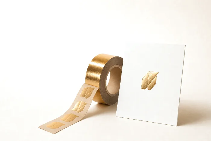
Foil stamping — also called foil blocking or hot-foil stamping — is a decoration process that transfers a thin coating of metalized film from a carrier ribbon onto your packaging. What lands on the surface is an actual reflective layer, which is why foil looks so much brighter and cleaner than a printed metallic ink: it behaves like a tiny mirror rather than a pigment. The foil itself is a multi-layer ribbon — a polyester carrier, a release coat, the pigment or metalized layer, and an adhesive — and the process is really about getting that top layer to let go of the ribbon and bond to your substrate exactly where you want it.
Foil isn't only silver and gold. The ribbon can be matte or gloss metallic in almost any tone, a pigmented (non-metallic) color, a pearlescent, or a holographic or patterned foil that diffracts light into a rainbow or a repeating texture. Because the effect comes from a physical film, it reads as premium in a way that CMYK simply can't fake — which is exactly why it shows up on spirits, beauty, confection, supplements, and any package that wants to feel like a gift. This article is a spoke in our guide to packaging printing methods; here we focus on how foil specifically works and how to design for it.
Hot foil vs cold foil
There are two families of foil application, and they solve different problems. Understanding the split is the single most useful thing a buyer can know about foil, because it drives cost, detail, and which converters can run your job.
Hot foil is the classic method. A metal stamping die is heated and pressed against the foil ribbon and the substrate together. The heat and pressure activate the adhesive and release the metal layer precisely under the raised areas of the die, so the metal ends up bonded to the surface in the shape of the die. It's a discrete pass with its own tooling — which is what gives it crisp edges and the ability to combine with embossing.
Cold foil is a newer, inline approach. Instead of heat and a metal die, the press lays down a UV-cured adhesive in the shape of the foil area, presses the foil ribbon against it, cures the adhesive so the foil sticks only where the glue is, and strips the rest away. Because it runs inline with the print unit, cold foil can cover large areas efficiently and — importantly — you can print process colors directly on top of the metal to create colored or gradient metallics in a single run.
| Aspect | Hot foil | Cold foil |
|---|---|---|
| How it's applied | Heated metal die presses foil onto the substrate | UV-cured adhesive holds foil inline on the press |
| Tooling | A stamping die per design (an added cost driver) | Uses a print plate for the adhesive image, no metal die |
| Detail | Sharpest edges; best for fine lines and small type | Very good, but slightly softer on the finest detail |
| Best for | Fine detail, accents, and combining with emboss | Large coverage areas and overprinted colored metallics |
| Overprinting | Usually applied after print; overprinting is harder | Designed to be overprinted for tinted/gradient metallics |
| Substrate feel | Can leave a subtle impression from the die | Lies flat and integrates with the printed sheet |
Neither is "better." Hot foil wins when the mark is small, intricate, or you want it raised; cold foil wins when the metal covers a lot of ground or you want it tinted a color your foil ribbon doesn't come in. A converter with a hybrid press may even use both on one job — cold foil for a large metallic background, hot foil for a crisp raised logo on top.
Strengths and trade-offs of foil
Foil earns its keep because it does something no ink can: it reflects. That reflectivity is worth planning around, and it comes with real constraints. Here's the honest ledger.
What foil is great at:
- True shine. Real metalized film outshines metallic ink by a wide margin — brighter highlights, a genuine mirror finish, and holographic effects ink can't produce at all.
- Perceived value. A foil accent reads as premium and tactile, which is why it's a shelf cue for gift, luxury, and hero SKUs.
- Durability. Foil is generally tough and doesn't fade the way some inks can, so it holds up on products handled a lot.
- Pairing. It combines with embossing, spot varnish, and soft-touch laminate for layered, high-contrast effects.
Where foil asks for care:
- Tooling and setup. Hot foil needs a die, and every foil area is an extra pass or unit on press — that adds tooling and setup effort. We keep cost talk qualitative here, but the direction is simple: more foil areas and more detail generally mean more setup.
- Detail limits. Very fine hairlines, tiny serifs, and thin reversed knockouts can fill in, break up, or fail to release cleanly. Foil likes a little more weight than ink.
- Registration. Foil placed to line up with printed elements has to register to them; tight registration between a printed color and a foil edge is harder than color-to-color print. Design so normal drift doesn't show — see how to build a print-ready PDF.
- Recyclability. Large or full-coverage metalized areas can complicate recycling of the base material; small accents are generally more forgiving. Confirm with your recycler for the specific substrate and coverage.
Designing artwork for foil
The most common foil mistake in a design file isn't aesthetic — it's structural. Designers sometimes hand over a flattened picture that looks gold and expect the converter to "make that part shiny." A press can't infer intent from a shiny-looking gradient. Foil has to be defined the same disciplined way a dieline is: as an explicit, separable instruction. Follow these steps and your foil job will move without a back-and-forth.
- Give foil its own named spot layer. Create a separation named clearly (for example
FoilorFOIL-SILVER) and place every foil element on it as a solid vector shape. This is exactly the discipline that keeps a print-ready PDF from bouncing. - Make it vector, at full solid coverage. Foil is on-or-off — there's no such thing as a half-strength foil tint in a single pass. Don't build it from a screened raster; use clean vector shapes so the tool or plate can be made from the path.
- Respect minimum weights. Keep foil lines and type heavier than you would for ink, avoid very fine serifs and hairline rules, and give small foil elements breathing room. There's no single universal minimum — it depends on the foil, die, and substrate — so ask your converter for their current limits for your job.
- Plan the trap and gaps. If foil abuts a printed color, decide whether they should touch, slightly overlap (trap), or leave a hairline of substrate between them, so registration drift doesn't create a visible gap or a muddy overlap.
- Mark overprint intent. If you want cold foil overprinted with color to create a tinted or gradient metallic, say so explicitly and set the artwork up for it — don't assume the converter will guess.
A quick sanity check that saves reprints: turn off every layer except the foil separation and look at it alone. If what's left is a clean set of solid shapes at a sensible weight, you're ready. If it's a speckled gradient or a stray hairline, fix it before the file ships.
Combining foil with embossing and finishes
Foil rarely travels alone on a premium package. The effects that make packaging feel expensive are usually layered, and foil is the anchor for most of them.
The headline pairing is combination stamping — foiling and embossing an element in a single hit with one sculpted die, so the mark is both metallic and raised. It's a hallmark of high-end cartons and labels because the two effects register perfectly to each other by definition (they're the same tool). If you're weighing raised versus recessed effects, our guide to embossing and debossing walks through the die pairs and substrate rules that make combination work.
Beyond emboss, foil plays against matte and tactile finishes for contrast. A soft-touch laminate with a bright foil accent, or a matte area next to a mirror-foil logo, reads far more premium than either effect alone. The finishes catalog — soft-touch, spot UV, tactile varnish, and holographic effects — is covered in specialty print finishes, and on pressure-sensitive labels the same choices show up in label finishes and laminates. Each of these is, like foil, its own pass and its own named layer in the file, so the golden rule holds: one effect, one separation, clearly labeled.
When to choose foil, and how PackOS handles it
Reach for foil when the goal is shelf impact or a premium cue, and when the metallic element is important enough to justify an extra pass. Choose hot foil for small, crisp, or raised accents — a logo, a crest, fine type — especially if you want to combine it with embossing. Choose cold foil when the metal covers a large area, when you want to print colors on top of it, or when running inline keeps the job efficient. If you only need a hint of sparkle across a big background and detail doesn't matter, a metallic ink or a metallic substrate might get you close for less effort — foil is worth it when the shine has to be genuinely brilliant.
Because the right decision depends on your format, run length, and how the foil interacts with the rest of your print, use the print method selector to narrow it down before you brief a converter. And because PackOS sells no single press — we're deliberately method-agnostic — the guidance here is about what fits your package, not about steering you to one machine.
How PackOS handles foil and specialty layers: when you upload artwork, PackOS reads the structure and the separations, so a named foil or emboss layer is recognized as its own decoration rather than flattened into the picture. That means the effect is preserved through the photoreal proof and carried into the production file and quote, instead of being lost or guessed at. You can see how the platform classifies print and finish layers on the technology page, or just upload a real file and let it detect the foil for you with Quick Quote.
Frequently asked questions
What's the difference between hot foil and cold foil?
Hot foil stamping presses a heated metal die against a foil ribbon to transfer metal onto the substrate, so it needs a die and suits crisp detail and combining with embossing. Cold foil is applied inline on the press using a UV-cured adhesive instead of heat, so it needs no separate die and suits large areas and printing process colors on top of the metal. Hot foil generally gives the sharpest edges, and cold foil generally runs faster and integrates with the print in one pass.
Is foil stamping the same as metallic ink?
No. Metallic ink is a printed ink loaded with metallic pigment, so it looks metallic but stays relatively flat and muted. Foil stamping transfers a thin layer of real metalized film, which reflects far more light and reads as a true mirror shine. Foil almost always looks brighter and more premium than metallic ink, but it is a separate process with its own tooling and setup.
Can foil-stamped packaging be recycled?
It depends on the substrate and how much foil is used. A small foil accent on paperboard is generally tolerated by paper recycling streams, while heavy or full-coverage metalized film can interfere. Recyclability rules vary by material and by local program, so confirm with your recycler and check the recyclability of the base material before you commit to large foil areas.
What is the minimum line weight for foil?
There is no single universal minimum, because it depends on the foil, the die, the substrate, and the process. As a rule of thumb, keep foil lines and text thicker than you would for standard ink, avoid very fine serifs and hairline rules, and give small foil elements a little breathing room. When in doubt, share your art with your converter early and ask for their current minimums for the specific foil and stock.
Can you print on top of foil?
Yes, but it depends on the method. Cold foil is designed to be overprinted, so you can lay process colors on top of the metal to create colored or gradient metallics in one pass. Hot foil is usually applied after printing, so overprinting it is harder and may need a foil made to accept ink. Tell your converter early if you want colored or tinted foil so they can pick a compatible process and foil.