
Embossing and debossing explained, for packaging
A foil logo catches the eye; an embossed one makes a customer's thumb pause. Embossing and debossing are the tactile finishes that turn a flat printed panel into something people want to pick up — and they are simpler to specify than they look, once you know what the dies actually do.
THE SHORT ANSWER
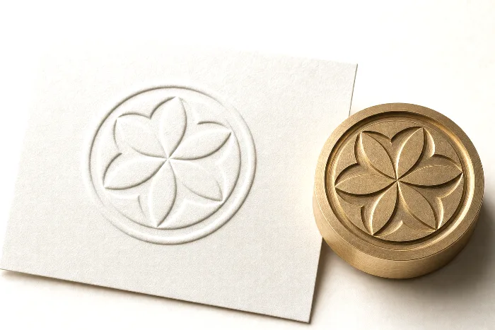
Embossing raises an area of the substrate above the surface; debossing presses it below. Both effects are made with a matched pair of metal dies — a raised (male) die and a recessed (female) die — that squeeze the material between them under pressure, and often heat. Neither adds ink on its own — the effect is purely the new shape of the material.
- Emboss = raised, deboss = recessed — a physical deformation of the stock, not a printed layer.
- A male/female die pair does the work; the effect has to exist as its own artwork layer.
- Heavier, uncoated, and textured stocks hold the impression best; thin films and tight radii fight it.
- Blind (no ink or foil), registered (over printed art), and combination (with foil) are the three common looks.
- It is a separate tool and press pass, so it adds cost and lead time — worth it for premium cues.
What embossing and debossing are
Embossing and debossing are structural finishes: instead of laying something onto the surface the way ink or varnish does, they reshape the material itself. An emboss pushes a shape up toward the viewer; a deboss presses the same shape down into the stock. Run a finger across either and you feel a permanent change in the surface — that tactile cue is the whole point, and it is why premium spirits, beauty, and confection brands lean on it so heavily.
Because the effect is the shape of the material and nothing else, an emboss or deboss with no ink and no foil — a blind emboss — reads only through light and shadow. That subtlety is a feature: a tone-on-tone blind emboss on an uncoated carton signals quality in a way a printed logo cannot. It is one of the decoration methods covered in our guide to packaging printing methods, and it usually sits on top of whatever printing method produced the panel underneath.
How the dies do the work
Every emboss and deboss is made by a matched pair of tools. The die carries the shape; the counter (also called the female die) is its mirror image. The material is fed between them and the press closes, forcing the stock to take the form of the die. On coated or textured stocks a heated die helps set the impression cleanly so the shoulders of the shape stay crisp rather than springing back.
Two things control how the finished effect looks. Depth comes from how deep the die is cut and how much pressure the press applies — a shallow single-level die gives a gentle rise, while a deeper die reads boldly from across a shelf. Levels come from how the die is engraved: a single-level die lifts the whole shape to one height, while a sculpted (multi-level) die is carved to several depths so the impression has contour, like a coin or a crest. The bevel angle on the edge of the die decides whether the effect reads as a sharp step or a soft dome.
Die material matters for detail and durability. Magnesium and copper dies are quick and economical for shorter runs; brass dies cost more to make but hold fine detail and survive long, high-volume runs — a classic run-length trade you also see in printing plates and other tooling. The counter is often built up on press from the die itself during make-ready, which is one reason the first setup takes time even when the artwork is simple.
Blind, registered, and combination effects
The same raise-or-recess mechanism produces several distinct looks depending on whether ink or foil is involved and how tightly the impression is aligned to the printed artwork.
| Style | What it is | Best for |
|---|---|---|
| Blind emboss / deboss | Raised or recessed with no ink or foil — reads through light and shadow | Tone-on-tone logos, subtle luxury cues, uncoated stock |
| Registered emboss | The impression is aligned precisely over a printed element so the print lifts off the panel | Lifting a printed logo, icon, or seal into relief |
| Combination (emboss + foil) | One die foils and embosses the same area in a single pass — a "combo stamp" | Metallic logos with real dimension; shelf pop |
| Sculpted / multi-level | A die carved to several depths for a bas-relief effect | Crests, coins, portraits, textured backgrounds |
| Ink-filled deboss | A recess filled with ink for a stamped, inlaid look | Crisp debossed type with color contrast |
A registered emboss is the fussy one: because the impression has to land exactly on the printed shape, it depends on tight print-to-emboss alignment, and any normal drift shows as a halo of unlifted print. The safest premium effect is often the combination die, where foil and emboss happen together so they can never fall out of register with each other. That "combo stamp" is worth reading alongside our guide to foil stamping, since the foil layer follows the same hot-stamp mechanics.
Substrates and design rules
Embossing is fundamentally a paperboard and label technique. Heavier, uncoated, and textured stocks can be permanently reshaped without failing, so they hold depth beautifully. Coated and heavily varnished stocks are more likely to crack at the shoulder of the impression, and thin films or laminated pouch materials tend to spring back or distort — an emboss can even disturb the barrier or seal on a flexible structure, which is why you rarely see true embossing on a stand-up pouch.
The rule people forget is show-through. Because you are pushing material in one direction, the reverse side carries the opposite impression — an emboss on the face leaves a recess on the back. On a folding carton that ghost lands on the inside, so you plan around it rather than fighting it; you never put a second emboss or critical print directly behind the first. Keep the effect back from folds, creases, and trimmed edges too, because those carry their own tolerances and a raised shape sitting on a crease looks like a defect.
Detail has limits. Very fine lines, delicate serifs, and small type tend to fill in or tear when the stock is forced to stretch around them, so give strokes enough weight and keep clearance between elements. Large solid embossed areas can look uneven — an effect the trade calls "oil-canning" — so a bold outline often reads better than a big filled panel. A practical setup checklist:
- Put the emboss or deboss on its own named spot layer, drawn as clean vector — never a raster bevel or drop-shadow effect faked in Photoshop.
- Keep strokes and type above a workable minimum weight so fine detail doesn't fill or crack.
- Hold the shape back from folds, creases, and trims by a safe margin.
- Plan for show-through — keep the reverse side clear directly behind the impression.
- For sculpted looks, mark the levels so the die-maker can cut the depths.
- Choose a stock heavy enough to hold depth, and proof coated stocks for shoulder cracking before you commit.
All of this rides on supplying the effect as a real, isolated layer — the same discipline that keeps a cut path or a spot varnish clean. Our guide to building a print-ready PDF for packaging covers how to name and separate those layers so the die-maker can pull the emboss shape without guesswork.
Where embossing and debossing fit
Embossing shows up wherever a brand wants the package to feel expensive in the hand:
- Folding cartons — an embossed logo on the face panel of a spirits, beauty, or confection carton is a signature move. If you are choosing a carton structure, our folding carton styles guide pairs well with a decoration plan.
- Pressure-sensitive labels — embossed and combination foil-embossed labels are everywhere on wine, spirits, and premium beauty bottles, where the label carries the whole tactile story.
- Rigid boxes, hang tags, folders, and covers — thick, uncoated stocks are ideal canvases for a deep blind emboss.
- Flexible pouches — generally not a fit, because the film and barrier don't take a permanent impression well; brands usually reach for foil or specialty inks there instead.
Embossing is one item on a broader menu of tactile finishes — soft-touch laminate, spot UV, and textured varnishes among them. If you are weighing several effects against each other, our guide to specialty print finishes lays out how they compare and combine, and the print method selector can help you line decoration choices up against your format and run length.
What it costs (and how to keep it sane)
Because PackOS quotes many formats and works with many decorators rather than pushing one press, we can be blunt about the cost drivers instead of selling a single answer. Two things move the price on an emboss: the tooling — the die itself — and the press pass, which is an extra operation the material has to run through. Sculpted multi-level dies and combination foil-emboss dies cost more to cut than a simple single-level die, and every added impression or color adds setup. Brass dies carry a higher tooling cost than magnesium but earn it back on long runs by holding detail; that is the same run-length logic behind plate and tooling economics generally.
Keeping it economical is mostly about restraint and reuse. A few honest levers:
- Emboss the hero, not the whole panel — one confident logo reads more premium than a busy sheet of texture, and it keeps the die simpler.
- Reuse the die across SKUs — a shared logo emboss can amortize its tooling over a whole line.
- Combine in one pass — a combination foil-emboss die can be more efficient than running foil and embossing as two separate operations.
- Match the die to the run — a short run rarely justifies a brass die; a long, repeating run usually does.
We keep every figure here qualitative on purpose: real numbers depend on your stock, size, run length, and decorator, so the honest way to see them is a quote on your actual job.
How PackOS handles tactile finishes
PackOS treats an emboss or deboss the way it treats a cut path or a spot color: as its own layer in the artwork model, not a cosmetic afterthought. When you upload a file, it reads the finish layers, shows the raised or recessed effect on a photoreal 3D proof so you can judge the depth before any tooling is cut, and flags when your stock choice will fight the impression. Because it is method- and decorator-agnostic — PackOS does not sell one press — it can route the job to the right shop and roll the die tooling and the extra press pass straight into the quote.
The practical upshot: you see the finish, understand what it will take to make, and get a price in one place. Upload real artwork and try it with Quick Quote.
Frequently asked questions
What is the difference between embossing and debossing?
Embossing raises an area of the material above the surrounding surface, so it stands up toward the viewer. Debossing presses that area down, creating a recess. Both use a matched pair of metal dies and pressure, and neither adds ink on its own — the effect is purely the shape of the material.
Do embossing and debossing add any color?
No. On their own they are colorless — a blind emboss or deboss relies only on light and shadow across the raised or recessed shape. To add color you either register the impression over printed artwork, fill a deboss with ink, or combine the emboss with foil stamping in a single pass.
What substrates work best for embossing and debossing?
Heavier, uncoated, and textured paperboard and label stocks hold the effect best because they can be permanently reshaped without cracking. Coated stocks can crack at the edge of the impression, and thin films or laminated pouch materials tend to spring back or distort, so embossing is mainly a paperboard and label technique.
Can you combine embossing with foil stamping?
Yes. A combination die, sometimes called a combo stamp, applies foil and embosses the same area in one pass, so the metallic foil sits on the raised surface. It is one of the most common premium finishes and is more efficient than running foil and embossing as two separate operations.
How do I set up artwork for an emboss or deboss?
Supply the emboss or deboss as its own named spot layer, drawn as clean vector artwork rather than a raster bevel effect. Keep fine detail above a workable minimum weight, hold the shape back from folds and trims, and plan for show-through on the reverse side, since the material is physically pushed in one direction.