
Packaging design & dielines: the complete guide
A package is a manufactured object before it is a canvas. This guide walks the whole design path — structure, dieline, format, material, print, and proof — in the order the team that makes packaging at scale actually sequences it, so the file you approve is the package you get.
THE SHORT ANSWER
Packaging design is structural design first and graphic design second. You settle the format and the dieline — the flat cut-and-crease template at real dimensions — before the artwork, because the structure decides what the graphics can do, how the package is made, and what it costs. The reliable sequence is:
- Structure before surface — the format and dieline come before any artwork
- Format follows the job — carton, pouch, label, or corrugated, chosen by fill, barrier, and shelf
- Material sets the rules — the substrate governs barrier, print, and recyclability
- Print needs margins — bleed out, safety in, artwork mapped panel by panel
- Proof before you commit — the last cheap moment to fix anything
What packaging design really is
Most people picture packaging design as the artwork — the logo, the colors, the photography on the front of pack. That is the visible half, but it is the second half. Underneath every good package is a piece of engineering: a shape that holds a specific product, survives a specific supply chain, runs on a specific machine, and comes apart the way a specific person expects it to. Design the surface first and force a structure to carry it, and you inherit every constraint the hard way — on press, when changes are expensive.
So the discipline splits in two, and the order matters. Structural design decides the format, the dimensions, the closures, and the dieline. Graphic design then dresses that structure, mapping brand artwork onto panels that already exist. The whole point of this guide is that the second job goes smoothly only when the first is settled. Everything below follows that sequence: what the structure is, how the dieline encodes it, how to choose a format and a material, and only then how to design the print and prove it out before you commit.
The dieline: the foundation everything else inherits
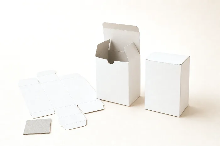
The single most important artifact in packaging design is the dieline: the flat, two-dimensional template that shows exactly where a package is cut, creased, folded, and sealed before it is a package at all. It is the shared source of truth that the die-maker, the printer, the structural designer, and the graphic designer all work from. If you are new to the term, start with our full guide to what a dieline is; here we care about why it sits at the root of the whole design tree.
The reason the dieline is foundational is that every later stage inherits it. The artwork is placed on the dieline's panels. The 3D proof is folded from the dieline's creases. The material area — and therefore the cost — is measured off the dieline's outline. The pallet and freight math depends on the finished dimensions the dieline produces. Because of that inheritance, an error at the dieline stage does not stay small: a panel that is two millimeters short, a fold placed on the wrong line, a glue tab facing the wrong way — each one propagates all the way to the press and shows up in every unit. Get the dieline right and the rest of design is placement and judgment. Get it wrong and no amount of beautiful artwork saves the package.
Choosing a format: carton, pouch, label, or corrugated
Before a dieline exists, you choose a format — the structural family the package belongs to. This is the highest-leverage decision in the whole process, because it fixes the material options, the print method, the closure, the machine that fills it, and the rough cost per unit. Pick the format from the job the package has to do, not from what looks good in a rendering.
| Format | Best for | Key constraints |
|---|---|---|
| Folding carton | Rigid or dry retail goods, unit boxes, sleeves and cartons that need flat, premium print panels | Adds shelf depth and material cost; little barrier on its own; needs clean creasing and a glue tab |
| Stand-up pouch | Snacks, powders, coffee, pet, supplements, refills — low weight and low cube | Barrier depends entirely on the film or laminate; few flat panels; recyclability hard unless mono-material |
| Label | Decorating a bottle, jar, can, or tin you already have | You inherit the container's shape and barrier; face stock, adhesive, and registration decide quality |
| Corrugated shipper | Protecting and moving units through the supply chain; retail-ready and display outers | Strength (ECT/BCT) and pallet fit drive the spec; print is coarser; flute affects creasing |
| Rigid / set-up box | Premium unboxing, gifting, high-value electronics and cosmetics | High tooling and unit cost; longer lead times; usually wrapped and assembled, not die-folded |
Two formats deserve their own deep-dives because their design vocabulary is so different from a flat box. Cartons come in dozens of structural styles — tuck-end, auto-bottom, sleeve, tray — each with its own folding logic; see folding carton styles. Pouches are defined by seal welds and gussets rather than cut panels, and their whole spec turns on film, closure, and finished dimensions; see the stand-up pouch spec guide and our overview of flexible packaging types.
Materials and substrates: what the package is made of
Format narrows the material list; the material you land on then sets the rules for barrier, print, and end of life. A substrate is not a neutral canvas — paperboard folds and prints beautifully but stops almost nothing on its own, while a laminated film can be an excellent barrier but cannot be creased into crisp panels. Choosing the substrate is really choosing which trade-off you can live with.
| Substrate | Typical use | Design implications |
|---|---|---|
| Paperboard (SBS, CCNB, kraft) | Folding cartons, sleeves, set-up boxes | Excellent print surface, folds cleanly; minimal barrier without a coating or liner |
| Corrugated (single / double wall) | Shippers, trays, point-of-purchase displays | Strength and stackability; coarser print; flute direction affects creasing and BCT |
| Flexible film & laminate (PET/PE, foil) | Pouches, bags, lidding, wraps | Barrier tunable layer by layer; joined by seals not folds; recyclability varies widely |
| Mono-material film (all-PE or all-PP) | Recycle-stream pouches and bags | One polymer family aids recyclability; barrier is the main trade-off to engineer around |
| Label stock (paper, film, BOPP) | Pressure-sensitive labels | Face plus adhesive plus liner; conformability and moisture resistance matter more than thickness |
Sustainability now sits inside this decision rather than beside it. Multi-layer laminates give great barrier but are hard to recycle because they mix polymers; a mono-material structure keeps everything in one recycling stream at some cost to barrier. That balance is worth its own read — see recyclable pouches and mono-material design — but the design lesson is simple: decide the end-of-life story while you are choosing the substrate, not after the artwork is signed off.
Designing for print: bleed, safety, and panel mapping
Once structure and material are fixed, the graphic design becomes a mapping problem: put the right artwork on the right panel, at the right size, with margins that survive the tolerances of cutting and folding. Three rules carry most of the weight.
- Bleed extends background artwork outward, past the cut line — a typical starting point is about 3 mm (0.125 in) — so a hair of misalignment on the cutter never leaves a white sliver at the edge. Some flexible and label processes want more.
- Safety pulls important content inward, away from cuts and folds, so barcodes, legal copy, and logos are never trimmed off or bent through a crease. A similar ~3 mm margin is a sensible default.
- Panel mapping is the packaging-specific part: because the sheet folds, the artwork has to be laid out so each design element lands on the correct face once assembled. What is adjacent on the flat is not always adjacent on the finished package.
Print method shapes these choices too. Flexo and gravure carry a fixed cost per plate or cylinder, so every additional spot color adds tooling — a reason to design within a tight palette. Ink coverage has ceilings as well; total ink limits in the region of 280–320% are typical, and a build that exceeds them will not dry cleanly. None of this is guesswork you have to hold in your head: a good preflight pass checks bleed, safety, separations, and ink limits automatically, which is exactly what the packaging preflight checklist is for.
Designing for the package's job: barrier, closure, and shelf presence
A package has three jobs at once, and structural design is where you decide how well it does each. It has to protect the product, open and close the way the user expects, and present itself on a crowded shelf. These pull in different directions, and design is the negotiation between them.
Barrier is about keeping oxygen, moisture, light, and aromas where they belong. Paperboard offers almost none on its own; films and laminates let you tune it layer by layer, adding foil or metallized layers for a strong barrier or accepting a lighter structure when shelf life is short. The right barrier is the least that protects the product for its real shelf life — over-spec and you pay for it in cost and recyclability. Closure is the human interface: a tuck-end or auto-bottom on a carton, a press-to-close zipper, tear notch, or spout on a pouch, a peel-and-reseal on a label. Closure decisions affect the dieline directly, because seals, notches, and tabs are lines on the template, not afterthoughts. Shelf presence — face area, proportion, how the structure holds light and stands up — is a structural property as much as a graphic one; the format you chose already set the canvas the artwork gets to use.
Designing for manufacturability and cost
The cheapest package is usually the one designed to be made, not the one made to be designed. A handful of structural choices move cost more than anything on the artwork:
- Fewer plates, tighter palette. Each additional spot color is another plate or cylinder and another registration to hold. Designs that live within a small, deliberate palette cost less and run more reliably.
- Standard sizes and stock tooling. A dimension that matches a standard sheet, a stock carton style, or an existing die avoids new tooling entirely. Custom geometry is worth paying for when it earns its keep, not by default.
- Nesting and yield. How the shape tiles across the press sheet or web — the step-and-repeat — decides how much material each unit consumes. A small change to a dimension or corner can lift the number of pieces per sheet and cut waste on every run.
- Manufacturable detail. Glue tabs wide enough to bond, creases the material can actually take without cracking, corners the die can hold — the unglamorous constraints that decide whether a beautiful file becomes a reliable package.
Because these are geometric facts about the dieline, they can be evaluated the moment the structure exists — long before anyone commits to tooling. That is where treating the dieline as a live, parametric model rather than a static drawing pays off.
The proof step: before you commit
The last stage of design is the cheapest place to catch a mistake, and the one most often rushed. A proof is a faithful preview of the finished package built from the same dieline and artwork the press will use — a flat mock-up that shows the printed sheet, and a photoreal 3D model folded from the creases so you can see the assembled object. Once tooling is cut and the press is running, changes are slow and expensive; the proof is the moment when they are still free.
A good proof review is a checklist, not a glance. Confirm that folds land where they should and panels map to the right faces; that colors and finishes read as intended; that barcodes, legal copy, and net-weight statements sit inside the safety margin and scan; that the closure and any window or tear feature are where the dieline put them. Approving a proof is approving the package — treat it as the commitment it is.
How PackOS handles packaging design
PackOS is built around this exact sequence. When you upload artwork or a die file, it detects the structure, classifies the cut, crease, and bleed lines, and rebuilds an editable, parametric dieline — so a change to one dimension reflows the seams, panels, and glue tabs instead of breaking them. From that model it renders a photoreal 3D proof and calculates an instant quote, because once the dieline is understood, the material area, the print, the nesting, and the production route can all be computed. In effect it runs structure, proof, and price in one pass. You can watch the reconstruction on the technology page, or run it on a real file with Quick Quote.
The full Design & Dielines library
This guide is the map; each stage below has its own deep-dive. Together they make up our complete library on packaging structure and dielines — read them in any order, or follow the sequence above.
- What is a dieline? The complete guide — the foundation: cut, crease, bleed, and safety lines, how to read and build one, and the mistakes converters bounce files for.
- Stand-up pouch spec guide: dimensions, materials & closures — how to specify a pouch end to end, from gusset and seal to film choice, zipper, and finished size.
- Folding carton styles — the common structural families — tuck-end, auto-bottom, sleeve, tray — and how to choose the right one for your product and line.
- Flexible packaging types — the wider world of bags, pouches, and wraps, and how film structures trade off barrier, cost, and recyclability.
- Recyclable pouches & mono-material design — how to keep a flexible package in one recycling stream, and where the barrier trade-offs land.
Packaging design rewards discipline in one specific way: settle the structure, get the dieline right, choose the material and format for the real job, and the graphic work becomes placement rather than firefighting. Do it in that order, prove it before you commit, and the file you approve is the package you get.
Frequently asked questions
Does packaging design start with the structure or the graphics?
The structure comes first. You settle the format, dimensions, and dieline before any artwork, because the shape decides where graphics can go, how many print plates you need, and what the package costs. Designing the surface first and forcing a structure to fit it is the most expensive way to work.
What's the difference between a packaging format and a dieline?
A format is the structural family — folding carton, stand-up pouch, label, or corrugated shipper. A dieline is the exact flat template for one package in that family: its real cut, crease, and bleed lines at true dimensions. You choose the format first, then the dieline realizes it.
How do I choose between a carton, a pouch, and a label?
Match the format to the job. Cartons suit rigid retail products and give flat print panels; pouches are light and flexible with good barrier and resealability; labels decorate a container you already have. Fill type, barrier needs, shelf presentation, and unit cost usually decide it.
How much bleed and safety margin does packaging artwork need?
A typical starting point is about 3 mm (0.125 inch) of bleed past every cut edge, with a similar safety margin holding text and logos inside the cut. Flexible packaging and labels often want more, so confirm the exact figures with your converter or a preflight check.
Why proof a package before committing to a print run?
A proof is the last cheap moment to catch a mistake. Once tooling is cut and the press is running, changes are slow and costly. A flat proof and a 3D mockup let you confirm that folds, panel mapping, color, and legal copy are right before any material is consumed.