
Label printing: the complete guide
A label order looks simple until the form asks for face stock, unwind position, and core size. This guide walks through every decision in a label order — what each one means, when it matters, and what it does to the price.
THE SHORT ANSWER
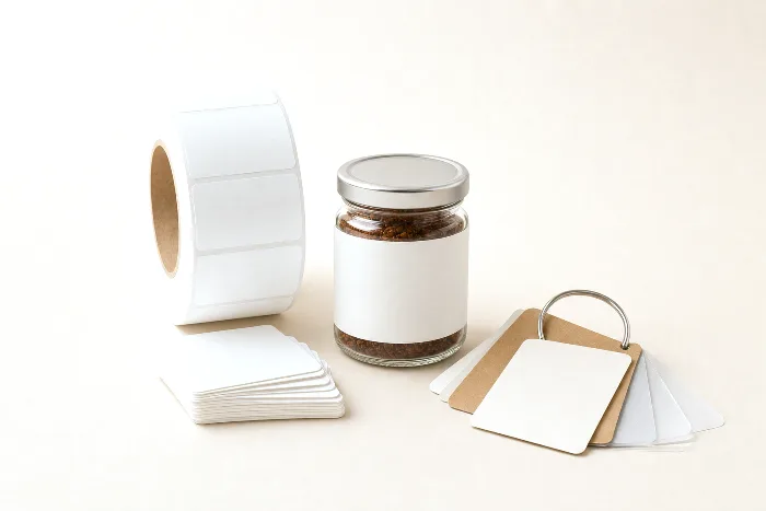
A pressure-sensitive label is a three-layer material — a printable face stock, an adhesive, and a release liner — that is printed, die-cut to shape, and supplied on rolls or sheets ready to apply. Buying labels well comes down to six decisions:
- Size and shape — driven by the container, not the artwork
- Material — paper for dry goods, BOPP or vinyl for moisture and squeeze
- Cut — die-cut through everything, or kiss-cut leaving the liner intact
- Roll spec — unwind position, core size, and roll diameter for machine application
- Finish — lamination or varnish for protection, foil for shelf impact
- Quantity — setup costs amortize, so unit price falls as runs grow
What a pressure-sensitive label is
Nearly every label you buy for a jar, bottle, box, or pouch is a pressure-sensitive label: it sticks with pressure alone, no water or heat required. Under the artwork it's a laminate of three layers:
- Face stock — the material that gets printed: paper, a plastic film like BOPP, or vinyl.
- Adhesive — permanent, removable, or specialty (freezer-grade, high-tack for rough surfaces).
- Release liner — the silicone-coated carrier the label peels away from at application.
The converter prints the face stock in a continuous web, cuts each label to shape, strips away the waste matrix between labels, and winds the finished labels — still riding on their liner — onto rolls. That liner-carried construction is what makes labels compatible with automatic applicators: the machine peels the label at a sharp edge and presses it onto the product as it passes.
The anatomy of a label order
Every label quote — from any converter — resolves to the same handful of specifications. Knowing them up front is the difference between a same-day price and a week of back-and-forth:
- Size and shape. Width × height of the finished label, and whether it's a rectangle (with corner radius), circle, oval, or a custom contour.
- Material. The face stock and adhesive pairing — a paper/permanent combination behaves very differently from a film/freezer-grade one.
- Finish. Lamination, varnish, foil, or nothing. This affects durability as much as looks.
- Cut and format. Die-cut singles, or kiss-cut labels on rolls or sheets.
- Roll specification. If machine-applied: unwind position, core diameter, maximum outside diameter, and labels per roll — all dictated by the applicator.
- Quantity and versions. Total count, and how many artwork versions (SKUs) share the run.
The rest of this guide takes these one at a time. Each section has a deeper companion article — collected in the full Labels library below.
Choosing a size and shape
Size is a container decision before it's a design decision. Measure the flat, printable area of the container — not its full dimensions — and leave breathing room. On a cylindrical bottle or jar, the label height must clear any shoulder taper or base chamfer; a label that runs onto a curve will wrinkle or flag at the edges. For small-diameter containers, a tall label wrapped around a tight radius is the classic failure: paper face stocks crease, and even films will lift if the adhesive can't hold the curl.
A few working rules:
- Wrap labels on round containers should either overlap themselves (full wrap) or leave a deliberate gap — a near-miss butt seam telegraphs every application tolerance.
- Front-and-back labels on the same container can often share one die if they share one size — fewer tools, one press setup.
- Standard sizes are cheaper and faster because the converter already owns the die. If your design can live at a standard size, let it.
- Corner radius matters. Square corners snag and lift; a modest radius applies cleaner and survives handling better.
Our label sizes guide covers common dimensions by container type and how to measure for a wrap.
Label materials at a glance
Material choice is mostly a question of what the label has to survive. Paper prints beautifully and costs the least, but it absorbs moisture. Films — BOPP (biaxially oriented polypropylene) and vinyl — resist water, oil, and scuffing, and they flex with squeezable containers. The quick comparison:
| Material | Durability | Best for |
|---|---|---|
| Uncoated / textured paper | Low — absorbs moisture, scuffs easily | Dry goods, craft and premium looks, short indoor life |
| Semi-gloss paper | Low–moderate — better scuff resistance, still moisture-sensitive | Boxes, mailers, food ambient shelf, barcodes |
| White BOPP | High — waterproof, oil- and chemical-resistant | Bottles, jars, refrigerated and bathroom products |
| Clear BOPP | High — waterproof, "no-label" look | Glass and clear containers where the product shows through |
| Vinyl | Very high — flexible, weather- and UV-tolerant | Squeeze bottles, outdoor use, curved and rough surfaces |
The adhesive is chosen with the face stock: permanent for almost everything, removable where the label must peel cleanly, and specialty grades for frozen, damp, or low-energy surfaces. If the product sweats — a cold bottle out of the fridge — paper is out and film is in. The full breakdown, including liners and adhesive grades, is in our label materials guide.
Die-cut vs kiss-cut, and rolls vs sheets
Two terms cause most of the confusion in label buying, and they describe the depth of the cut:
- Die-cut — the cut goes through everything: face stock, adhesive, and liner. The finished piece is exactly the label's shape. This is what most people picture as a "sticker" handed out at an event.
- Kiss-cut — the cut goes through the face stock and adhesive only, "kissing" the liner but leaving it intact. The label peels off a continuous backing. This is how virtually all product labels are supplied, because a continuous liner is what rolls, sheets, and applicators all depend on.
Format follows application method. Rolls are the production default: they feed automatic applicators and hand dispensers, pack densely, and suit any real volume. Sheets suit small runs applied by hand or printed in-house, and make sense when one order mixes many designs. If an applicator — yours or your co-packer's — will ever touch the labels, order rolls and get the roll spec from the applicator's manual before you order. The full comparison, including matrix and backing details, is in die-cut vs kiss-cut labels.
Roll direction and unwind position
Here is the specification that catches nearly every first-time roll buyer: unwind position, also called roll direction. It describes which edge of the artwork comes off the roll first — top, bottom, left, or right — and whether the labels are wound facing out or facing in. The industry numbers these orientations (positions 1 through 8 in the common convention), and every converter's order form asks for one.
Why it matters: an automatic applicator dispenses labels in one fixed orientation. If the artwork comes off the roll sideways relative to how the machine presents it to the container, every label goes on sideways — at full line speed. Hand application is forgiving; machine application is not.
- Hand-applied? Almost any unwind works. Pick the converter's default and move on.
- Machine-applied? The applicator's spec sheet dictates the unwind position, core diameter (commonly 3 inches for production applicators), and maximum roll outside diameter. Copy those numbers exactly.
- Changing hands later? If a co-packer might apply your labels, ask for their spec before ordering — rewinding rolls after the fact is an avoidable cost and delay.
Diagrams of each position and how to read an applicator spec are in roll direction and unwind positions.
Finishes: lamination, varnish, and foil
A finish does two jobs — protection and shelf presence — and the right choice depends on which job you're hiring it for:
- Lamination bonds a clear film over the printed face. Gloss laminate saturates color and wipes clean; matte laminate reads premium and hides fingerprints; soft-touch adds a velvety hand. Lamination is the workhorse protection layer for anything that lives in a bathroom, kitchen, or cooler.
- Varnish is a printed coating — thinner and cheaper than laminate, available gloss or matte, and spot-applicable, so you can gloss a logo against a matte field. It protects less than a laminate.
- Foil adds metallic shine, either hot-stamped with a die or cold-applied on press. Foil is the highest-impact finish and also the one that adds tooling and setup, so it rewards larger runs.
- Embossing and tactile coatings add texture the fingertip can find — common on wine and spirits, where the bottle is picked up before it's read.
A practical default: laminate anything that gets handled wet or often, varnish what needs modest protection at lower cost, and save foil and emboss for the SKUs that earn shelf-facing investment. Full pairings by material are in label finishes and laminates.
What drives label price
Label pricing is opaque from the outside but mechanical underneath. The drivers, in roughly descending order of weight:
- Total printed area. Size × quantity sets how much material and press time the job consumes. A bigger label costs more per unit; twice the quantity does not cost twice as much.
- Material and finish. Films cost more than paper; laminate adds a pass; foil adds a pass plus tooling. Each upgrade moves the unit price in the direction you'd expect.
- Colors and print method. Digital presses skip plates entirely, which is why short runs and many-version orders quote well digitally. Flexo runs faster at volume but pays a plate per color up front — more colors, more plates, more setup.
- Tooling. A standard die shape is free in practice; a custom contour buys a new die once, then amortizes across every reorder.
- Setup amortization. Every job carries fixed setup — press makeready, tooling, proofing. Small runs wear that cost per-unit; large runs dilute it. This is the single biggest reason unit prices fall with quantity.
How these drivers interact — and why the second thousand labels cost so much less than the first — is covered in label cost drivers, part of our broader guide to packaging costs.
Artwork and dieline requirements
Label artwork fails preflight for the same short list of reasons everywhere. Supply a vector dieline (or ask the converter for theirs), keep the cut path on its own layer or spot separation, and respect the two margins: bleed extending past the cut line — typically around 1.5–3 mm for labels, per your converter's spec — and a safety margin keeping text and barcodes inside the cut by a similar amount. Rounded corners, tight contours, and clear materials each add their own wrinkles: white-ink underprint on clear BOPP, for instance, needs its own separation.
The exact numbers and layer conventions are in label dieline and bleed specs, and the checks a converter runs on your file are the same ones in our packaging preflight checklist — run them before you upload and the proof cycle collapses to one round.
The full Labels library
This guide is the map; each decision above has a dedicated deep-dive:
- Label sizes: standard dimensions & how to choose — common sizes by container type, and how to measure a wrap.
- Label materials: paper vs BOPP vs vinyl — face stocks, adhesives, and liners, matched to what the label must survive.
- Roll direction & unwind positions — the eight orientations, with diagrams, and how to read an applicator spec.
- Die-cut vs kiss-cut labels — what each cut means, and which format fits hand vs machine application.
- Label dieline & bleed specs — the file requirements that get artwork through preflight the first time.
- Label finishes & laminates — gloss, matte, soft-touch, varnish, and foil, and when each earns its cost.
How PackOS quotes labels
Labels are what PackOS quotes today — the announcement bar at the top of this page is literal. Upload your label artwork and PackOS detects the die shape and dimensions, checks the file against the same print-quality rules a converter's preflight would apply — you can see how that verification layer works on the technology page — and returns a price while you watch. Every specification in this guide (size, material, finish, roll format, quantity) is a field you can flex in the quote and immediately see what it does to the number. That's the fastest way to internalize your own cost drivers: start a Quick Quote with a real file and try it.
Frequently asked questions
What is a pressure-sensitive label?
A pressure-sensitive label is a label that sticks with pressure alone — no water, heat, or solvent. It is built from three layers: the face stock you print on, the adhesive, and a release liner that carries the label until it is applied.
What is the difference between die-cut and kiss-cut labels?
A die-cut label is cut through the face stock, adhesive, and liner, so the finished piece follows the label's shape. A kiss-cut label is cut through the face stock and adhesive only, leaving the liner intact — which is how labels are supplied on rolls and peel-off sheets.
Should I order labels on rolls or sheets?
Rolls are the default for any real volume and are required for machine application. Sheets suit small runs applied by hand. If an applicator will ever touch the labels, order rolls and confirm the core size, maximum roll diameter, and unwind position against the applicator's spec.
Why does the unwind position of a label roll matter?
Automatic applicators dispense labels in one fixed orientation, so the artwork has to come off the roll facing the right way. The unwind position describes which edge of the label leaves the roll first. Hand-applied labels can use almost any unwind; machine-applied labels must match the applicator.
What makes labels more or less expensive?
The biggest drivers are total printed area (size times quantity), the material and finish, the number of colors and any tooling a custom shape or foil requires, and how far setup costs spread across the run. Larger runs lower the unit price because setup is amortized.